Enhancing Your Brand Identity
Your font is a key brand asset. Consistency across platforms is crucial, but with today’s digital landscape, you also need to consider cross-device adaptability.
Many legacy fonts—while beautiful in print – don’t render well online or lose clarity on high-resolution and small mobile screens. In 2025, variable fonts like Inter, Roboto Flex, and Source Serif 4 are increasingly popular, offering flexibility in weight and width without compromising load speed.
Readability & Accessibility Standards
Accessibility-first design is now a ranking factor and a legal requirement in many regions. When selecting a typeface:
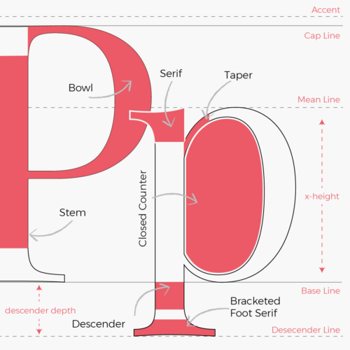
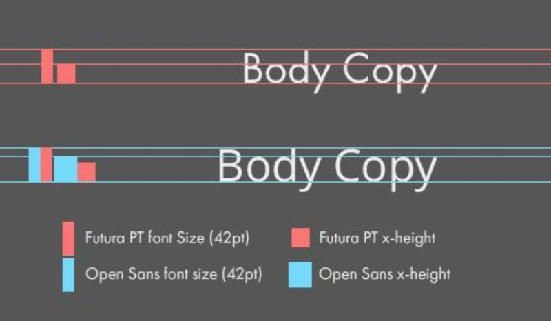
- X-height matters – Balanced proportions improve readability at smaller sizes.
- Contrast ratios – Meet WCAG 2.2 standards for legibility.
- Avoid all caps for long copy – Sentence case remains more readable for most users.
Modern responsive design demands that fonts scale cleanly across devices. For example, Fluid Typography techniques automatically adjust sizes based on viewport width.